True and Blue: Truecaller’s Logo History

Lindsey LaMont
Sep 20, 20233 min read
In 2009, we set off on a mission to completely change one of the most unique aspects of what makes us human: how we communicate with each other.
In 2009, we set off on a mission to completely change one of the most unique aspects of what makes us human: how we communicate with each other. Building Truecaller has opened our eyes to learn how different cultures talk to each other; how they trust each other, and how they keep each other safe. That mission is going strong fourteen years later. And it’s all because of you. When you change, we change.
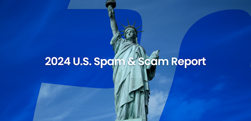
From a simple call identification app two friends created in Stockholm, to the world’s #1 go-to app for spam blocking and Caller ID, we’ve won the trust and the love of over 356 million people.
Always true and blue
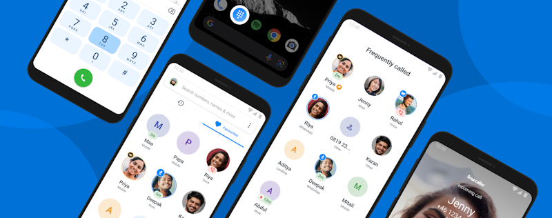
Our visual identity morphs throughout the years - but the core mission stays the same. We’ve always been the blue phone app in your lower left corner, the dialer to your long calls with friends, the clean inbox to your important OTPs and life messages. A true blue hero to save you from fraud calls and harassers.
“To build a brand, you need to first break it down.”
App icons are small in size, but are ‘icon-ic’ in helping you instantly recognize where to go in the sea of other applications.
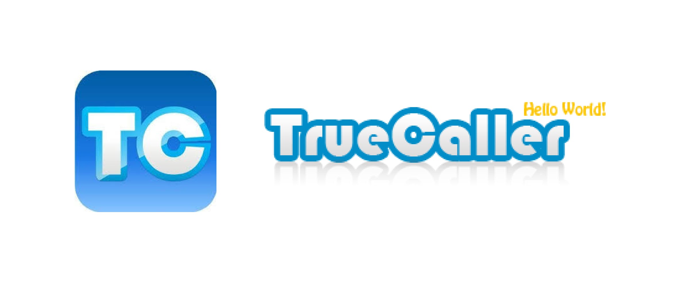
Our first logo was very literal in 2009, as the TC stood for Truecaller.
2012 is when we revealed our iconic logo with ‘true’. Back then, we had 4 million of you using our app. It’s the first time we put more meaning behind how the app identified the ‘truth’ in communication. Variations of this stuck around until 2016.


In 2016, the phone began to take over the app symbol as Truecaller became the default dialer for millions around the world.
The phone officially became the app symbol in 2017, along with a new wordmark that you see today. This was when Truecaller went through a new look and feel.

And today, we unveil a refreshed identity that reflects our ethos, our purpose and our promise. The world we live in is changing fast. What is “true” is increasingly coming under question. The more we look around, the more we realize that people today are even more vulnerable. To misinformation. Scams. To unscrupulous people and intentions.
To build a brand you need to break it down. Three things that are important to us as a brand - the true blue color, the cursive true, and the phone. We amplified our core assets and gave it a new look and feel. Every time you look at Truecaller in the app, social media, or elsewhere, you will see these elements.


The Core of Truecaller is People
Back when we started, we began with a simple objective – to remove uncertainty, to separate the signal from the noise, and ensure that no matter how technology changes, you will feel safe answering your phone. Along the way, we kept improving our technology, our privacy, adding new features to our app - but most of all, listening to you.
At Truecaller, we’ve made it our purpose to create a world that is true to people’s trust, time and efforts. We want to do that by putting the power back into the hands of the people, so that they have more control and can live their life with peace of mind.
We envision a world where the 356 million people who trust us come together to celebrate the meaningful calls, and call out the fake, the false and the dangerous. And in doing so, become the world’s largest community of trust to create a world that’s a little more true.
Let’s take the right call.
Lindsey LaMont
Sep 20, 20233 min read